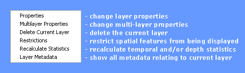
Layer Menu
The Layer menu contains the following options:
Properties, Multi-layer Properties, Delete Current Layer, Restrictions, Recalculate Statistics, Layer Metadata
Displays a properties form allowing the user to change various properties relating to a layer. The form has five tabs. For vector data these include:
and for raster data include:
To change any properties relating to a layer, make the layer active and then double-click the layer in the Layer Manager.
Using the Scaling tab you can make symbols either stay the same size on the screen when you zoom by clicking the Map View Co-ordinates radio button or make them represent the same area on the ground in the real world by clicking the Real World radio button.
You may also make the symbol size linearly or logarithmically proportional to the values of the attribute represented.
The sliders allow the symbol size for the minimum and maximum values to be set in terms of their size in real world units. To show a symbol 1mm wide on the screen at a scale of 1:50,000, set the symbol size to 50 metres. You can also use the text boxes to the right of the sliders to define the scaling values.
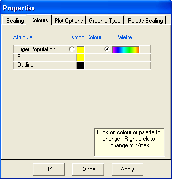
Using the Colours tab, you can change the colour used to display Features and Attributes.
If the radio button in the Symbol Colour column is checked then attributes are displayed as proportional symbols. Alternatively, if the radio button in the Palette column is checked then all symbols are displayed at the same size but are coloured relative to their attribute value.
Click on the Symbol Colour box to invoke the colour editor,
or click the Palette box to select a different colour palette.
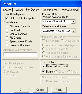
For point datasets it is possible to plot all sites as marker symbols rather than proportional symbols or coloured circles, by checking the Draw data as: Marker Symbols option.
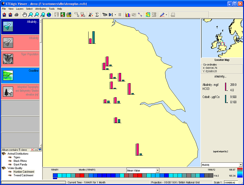
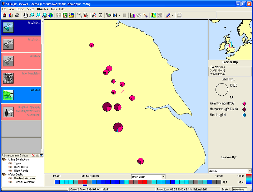
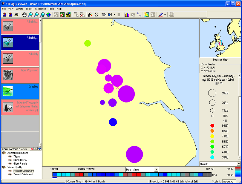
For point datasets with more than one attribute it is possible to display the attributes as a series of bar charts (see example), pie charts (see example), speedometer charts (see example), pairwise symbols (see example) where one attribute specifies the size of the symbol while the other specifies its colour, or dip and strike symbols to represent geological features (see example). For the latter type of display you must specify the size and colour attributes using the drop down list under the Pairwise Options. These lists only contain those attributes that are present in the current layer.
For a bar chart display each attribute is scaled independently and has its own key in the legend. However, the scaling may be made the same using the options on the Palette Scaling tab in the properties window.
For pie charts, it is assumed that all of the attributes are based on the same units. The sum of the values at each site are summed in order to calculate the radius of each pie chart. The size of the segments is then calculated by finding the proportion that each attribute contributes to the sum.
For speedometer charts, the largest attribute is selected to define the radius of the chart. Each segment is then defined by the proportion of each attribute to the largest one. In a similar frame to the pie charts, it is assumed that all attributes will have the same units for the charts to make any sense. An example of how a chart would look is given below.
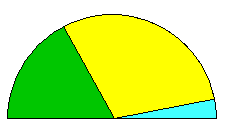 |
This example site has 3 attributes, represented by the three colours. The cyan attribute has a value of 200. It is the largest as is used to define the radius of the semicircle. The yellow attribute has a value of 180 while the green attribute has a value of 70. The size of these segments is calculated using their proportion to the largest attribute, i.e. they are drawn as 95% and 35% of a semicircle respectively. |
Polygon Data can be drawn without Fills or without Outlines by checking the appropriate boxes. The colour of the outline and the fill can be changed using the Colour tab. If a polygon layer contains multiple attribute then bar charts, pie charts or speedometer charts can be drawn at the centroid of each polygon by checking the appropriate check box.
Note: The name of a site can be drawn on the map by selecting the Draw Text with Data check box.
Using the Graphic Type tab, you can change the style of symbols, lines and fills used to display Features and Attributes.
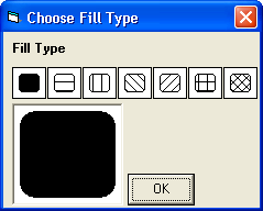
Click on the Symbol, Line, or Fill box to be changed to choose a new graphic type.
Click on any symbol, line or fill box and then click OK to change the graphic type.
The colours of these items are changed using the Colour tab.
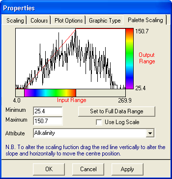
Any attributes may be displayed using a colour palette, whether the spatial data is point, line, polygon or grid. As a default, the colours in the palette are divided linearly between the minimum and maximum attribute values. In some cases your attribute values may not have a normal distribution between the minimum and maximum values. You can use the Use Log Scale check box to scaling the colours using a logarithmic division of colours which can help in some circumstances. Other attributes may have irregular distributions or odd peaks which distort the linear scaling so that you cannot see the detail in the remaining data. The palette scaling facility has been designed to allow users to select any part of the attribute range to be coloured using the full palette.
You can stretch the attribute values interactively or by using the text boxes provided e.g. type 0 in the minimum box and type 10 in the maximum box. Click on the Apply button to view the changes made. Alternatively, hold the the mouse down in the graph area and drag vertically to change the slope of the transformation and horizontally to move the transformation to the left or right.
Click on the Attribute drop-down list to select a different attribute in the current layer.
Click on the Set to Full Data Range button to reset the minimum and maximum values back to their original full data range.
Click on the Log Scale checkbox to use a logarithmic scale in the Map Window.
Note: Changing the colour scaling for gridded data can take some time if there are a lot of timeslices. Clicking on Apply changes the current timeslice only. Click on OK to change the colour scaling in all timeslices of the Current Layer.
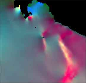
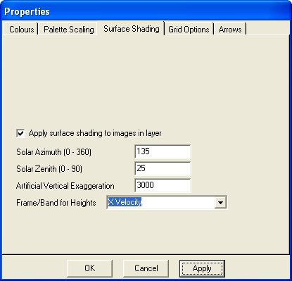
The items on the Surface Shading tab can be used to alter topographic style (Lambertian) shading of a surface. Click on the Apply surface shading check box to add shading add alter the available parameters to modify the appearance of the shading. The Solar Azimuth angle specifies the directional angle of the simulated illumination from North (0) to East (90) to South (180) and to West (270). The Solar Zenith angle specifies the vertical angle, where 0 indicates that the illumination is directly overhead and 90 implies that the illumination is on the virtual horizon. The Artificial Vertical Exaggeration number is used to alter the strength of shading, see below. The final option, Frame/Band for Heights allows you to pick another frame/band from the available grid attributes to act as the 'height' values. So you could have the colour taken from one attribute and the shading from another.
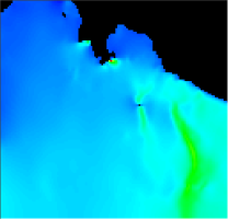
No shading |
Shading with a vertical exaggeration of 1000 |
Shading with a vertical exaggeration of 5000 |
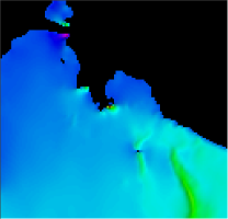
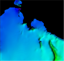
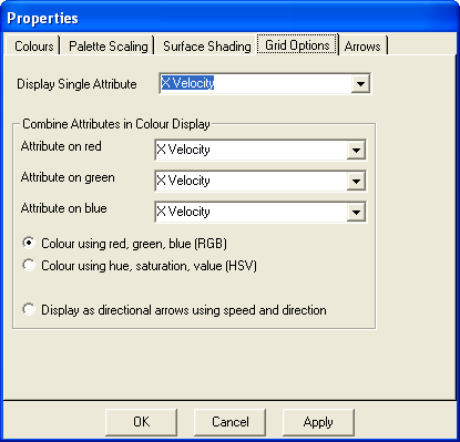
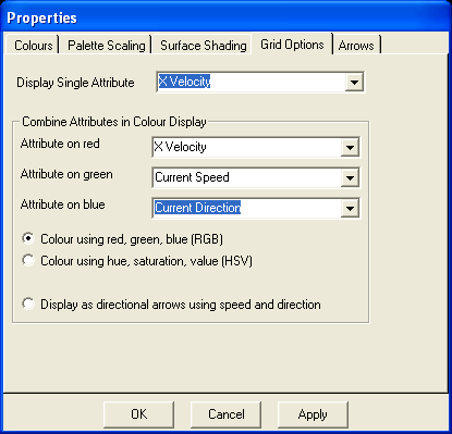
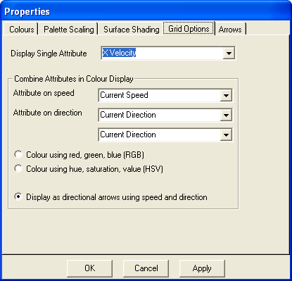
The Grid Options tab is used to define which frame/band or combination of frames/bands should be displayed and how they should be displayed. The options include:
Setup for single attribute display |
 |
Setup for RGB display |
 |
Setup for arrow display |
 |
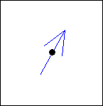
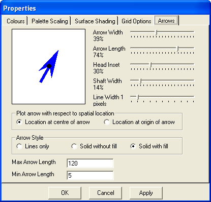
The Arrows tab can be used to modify the display characteristics of arrows displayed on the map.
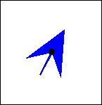
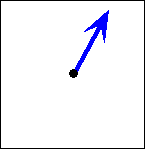
The controls illustrated above can be used to modify the appearance of arrows in a layer. As you move the sliders the appearance of the arrow on the form will change. A number of different arrows can be produced by changing these parameters, see the examples below.
 |
 |
 |
 |
Lines only |
Solid without fill and head inset of zero |
Solid with fill, small shaft width and large head inset |
Location at origin of arrow |
Select this options if you wish to animate a number of layers simultaneously or if you wish to change the properties of several layers at once.
A list is provided showing all currently loaded layers. Those that have similar attributes to the current layer are shown with a green background. To specify a Multilayer animation check the animate check box next to the layers that you wish to animate. Click the Close button and then animate the current layer. The other selected layers will also animate during the time range of the current layer.
Of course, not all layers will necessarily have the same time range or timeslice as the current layer. If you wish a layer to remain visible after its time range has passed but the current layer is still animating, then check the Persist check box next to the appropriate layer.
You may wish to change the properties of all the common layers (i.e. all those shaded green) at once, for instance if you wish to use a common colour scaling. To do this click on the Edit Properties of Common Layers button and use the Properties forms as described above.
Removes the data displayed as the Active Layer in the Map Window from the computer's memory. The data can be recovered by making another query to the database using the Query Wizard
This menu item can be used to restrict certain spatial features from being displayed in the map window depending on the number of timeslices present at each location. An application may be to show only those marine sites that have more than five years worth of data. In this case the user would select the > option and type 5 in the text box.
Note: To turn off the restrictions on a layer, select that layer as the current layer, return to the Restrictions menu option, and uncheck the Restrictions On/Off check box.
This option can be used to recalculate the statistics for the current layer. You may have chosen a monthly interval for your display but you now wish to view the data using an annual interval. You can use the Query Wizard to load another layer or you can use the Recalculate Statistics facility to achieve this.
This form is virtually identical to the third step in the query wizard. Select the time and or depth range in the same way and then click OK.
This menu option will display any metadata related to the currently active layer. Layer Metadata is also available from the toolbar.
| Browser Based Help. Published by chm2web software. |


